Tag Archives: programming

The Superior Feeling

To somewhat paraphrase that Shania Twain chorus, “God, I feel like a God today.”  I’ve mentioned before that being a programmer is the best thing in the world and it’s the closest you can get to being a god.  Parents, you may think you get to play god, too, but there’s a little issue with deleting your creations when you’re done with them.  So, being a programmer is still the best.

I’ve mentioned before that one of the best things about programming is the ability to automate.  Taking what would be an insurmountable task and making it simple.  And that is what I managed to do today.  As I’ve mentioned before, I’ve set up a music server in the house, Plex, and in prior posts, I’ve talked about my digital music collection.  Occasionally, I mention that the metadata in the files needs improvement.  And that is also what I’ve done.

Metadata in digital files can be as extensive as you want them to be.  At a minimum, you want the artist and song title to be in there, because most players display that important identifying information.  You can go further and add the album release year and genre, so you can sort and group things that are of similar values.  You can go further still and embed artwork in the file, usually the album cover, so your music player can display that, too.  You can go even further than that and put the lyrics for the song in the metadata so some players will show you the lyrics while the song plays.  That is where I am at and it is what I have done.

There are utilities that let you edit the metadata directly, so you can create a new tag and paste in the lyrics for a song.  But, is that even fathomable to do with over 15,000 songs?  There are tools that will let you look up the lyrics to a song and create the tag automatically, but still, song by song.  I never got to the point of finding utilities that would process a whole album at one time, because I realized I could do it better.  I could do it exactly as I needed it to be done.

With Plex, there is no support for embedded lyrics in the metadata.  Instead, they use what’s called a “side-car” file, which is the same file name, but different extension.  So you have your .flac file and a duplicate .txt file with the lyrics.  Ok, that’s pretty crappy, but I can do it.  But, if I’m going to go through the trouble of getting all these lyric files, why not embed them at the same time?

So I did a quick search online and found a code library that would read and write FLAC metadata.  That’s the only thing I couldn’t do on my own, so I was golden now.  I learned of a website that had a simple means of downloading lyrics through their website, as long as I stripped out everything else from the webpage.  A simple RegEx statement accomplished that.  Writing to a text file, recursing through directories,  all that is simple stuff.
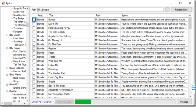
image1

So, I process each artist in a batch, which enumerates all songs for all albums.  One button click to retrieve all the lyrics for all the songs, then a review of any songs that had no matches.  Correct the titles for the non-matches and get lyrics again.  Then a button to process the lyrics which both embeds the lyrics in the FLAC files and also creates a sidecar text file with the lyrics.  So, if all goes well, one double-click on the artist folder, click on Retrieve Lyrics, scroll to confirm that all lyrics came in, click Process.

So, yeah, I do have to process a little over 500 artists, but that is substantially better than thousands of albums or many thousands of songs.

It’s Good To Be A Coder

While driving over the weekend, I had a humorous thought that I think I can stretch out into an extended joke.  The base premise of the joke is simple, just recaptioning an old comic strip to change the context of the comic and the dynamic between the characters.

So, to begin this, I need the original comic strips so I can deface them and make them funny in a different way.  I found the website that was hosting the comics and looked into what effort it would take to get these comics.

Here’s a small lesson in image thievery on the internet.  The most pedestrian way to get an image off the internet is to do a screen capture with something like Snipping Tool.  That route will burn you out in a matter of minutes.

The better way is to right-click the image and choose Save As.  This preserves the original image dimensions without any possible variance from lassoing.  However, web developers have gotten smarter about this technique and will do protective coding to prevent the unwanted downloading of their files.  One way to do this is to capture the mouse’s right-button click.  Other way is to overlay a transparent image over the other so when you right-click and Save As, you save the transparent image instead of the one you really want.  The most effective way is to show the image as a CSS background.  However, the truth is, if it’s in your browser, your browser requested the file and you can do it too.

To get around these tricks, you can use the developer tools built into most browsers.  They will allow you to look at the source code and find the URL of the actual image you want.  That is the path I originally took, finding the image tag, copying the URL into a new tab, then downloading/saving the image.  That lasted for about 7 images before it was too much effort.  Coders are lazy, and they write programs to do the work for them.

Looking at the URL for the image, it was a dynamic URL, not a static one.  It was similar to:

http://thewebsite.com/content.php?file=QXJlbid0IHlvdSBjbGV2ZXI/

At first, I was discouraged, because the file parameter just seemed to be a string of random characters.  There wouldn’t be any way to turn that into a reliable sequence to cycle through.  But the more I looked at the URL, the more familiar the text seemed.  I took a guess that the string was Base64-encoded, and my guess was correct.  Decoding the string resulted in another URL, although that URL was not accessible from the internet.  It was a page that “content.php” had access to, though. (Just as an aside, this programming design screams “security issues!”)

The decoded URL had a very understandable structure that would allow cycling through comics based on date.  It’s just that I would need to construct that URL, encode it in Base64, then pass the encoded URL as a parameter to the content.php address.

I fired up Visual Studio, added a datebox and a button.  I wrote 4 lines of code to construct the URL based on the date in the datebox, then download and save the image. Then I set up the button to decrement the datebox by a day and process the image.  Now, All I had to do was click a button over and over and the images would dump into a folder.  If I wanted to, I could set up a loop to cycle through images and I wouldn’t even need to click the button at all.  This was less than 15 minutes of effort.

And that is yet another example of the power that comes from being a programmer.

A Nose For News

Update: Now with even more noses!

Before I updated my phone to Windows 10, I used the Microsoft Money app for news.  It had a glitch where if a photo was a certain size, it would zoom in on a smaller portion of the photo.  This resulted in an article thumbnail image that really had little to do with the story.

I don’t have this app anymore, so I present to you: My archive of noses:

wp_ss_20160613_0001 wp_ss_20160613_0002 wp_ss_20160628_0001 wp_ss_20160630_0001 wp_ss_20160706_0001 wp_ss_20160714_0001 wp_ss_20160720_0001 wp_ss_20160811_0001 wp_ss_20160816_0001 wp_ss_20160819_0001 wp_ss_20160823_0001 wp_ss_20160823_0002 wp_ss_20160826_0001 wp_ss_20160829_0001 wp_ss_20160905_0001 wp_ss_20160913_0001 wp_ss_20160914_0001 wp_ss_20160914_0002 wp_ss_20160916_0001 wp_ss_20160922_0001 wp_ss_20160922_0002 wp_ss_20160928_0001 wp_ss_20160928_0002 wp_ss_20160929_0001 wp_ss_20161004_0001 wp_ss_20161006_0001 wp_ss_20161006_0002 wp_ss_20161010_0001 wp_ss_20161012_0001 wp_ss_20161020_0001 wp_ss_20161028_0001 wp_ss_20161107_0001 wp_ss_20160227_0001 wp_ss_20160323_0001 wp_ss_20160324_0001 wp_ss_20160329_0001 wp_ss_20160330_0001 wp_ss_20160330_00021 wp_ss_20160403_0001 wp_ss_20160407_0001 wp_ss_20160412_0001 wp_ss_20160412_00021 wp_ss_20160413_0001 wp_ss_20160414_0001 wp_ss_20160429_0001 wp_ss_20160503_0001 wp_ss_20160525_0001 wp_ss_20160527_0001 wp_ss_20160527_00021 wp_ss_20160606_0001 wp_ss_20160609_0001 wp_ss_20160610_0001

The Firehose

Many yeas ago (geez, it hurts to say years), I had the idea the rework the Microsoft Money application.  I got a little ways into it and just kind of stopped.  Recently, the idea has been coming back to me, especially with the new Windows Universal apps design.

So, I loaded the code back up and saw that I had a pretty decent base to start with, so I do what I normally do when I have a large, daunting task in front of me.  I mad a list of all the steps that need to be done.  That usually works for me.

After making a decent high-level list of tasks to be done, I changed gears and started doing mock-ups of screens.  I’m probably putting way too much time into the design, because I want it to look as similar to the original as possible.

That kind of design is difficult.  If you don’t do it exact, and I mean exact, people will just say it’s a knock-off.  But if you do your own thing entirely, people will say it’s nothing like the original.  So, it’s really a gamble.

After taking a break from that, I decided I would peek into MS Money’s resource files to see if there were any clues as to what I need to do.  Holy shit, bad idea.  Microsoft kept all their pop-up forms in the resource file.  There are over 600 pop-up forms in MS Money.  Just the effort in recreating these forms is entirely overwhelming.  Then considering the logic involved as to when they are shown and the processing after they are closed, I can’t process that amount of effort at the moment.  Again, if you’re going to copy an application, you sort of have to do the whole thing, or at least have a roadmap as to when it will get done.  My list just got a whole lot longer.

So I opened up my list and started analyzing again.  I have about 45 top-level screens and most have multiple pop-ups.  And I’m not even done analyzing the application yet.  One good thing (relatively) is that my original scope was for the personal version and now I’m running the business version, which more than doubles the capabilities of the application.  So, I can certainly lower my expectations for a first release if and when it comes to that.

As far as releases go, it would definitely have to be incremental.  There’s so much to do.

“This” Is Not Good.

I write Windows software for a living and as a hobby.  When Windows 8 came out and they introduced the new Metro/Modern app paradigm, I was unconvinced.  I never investigated why I felt that way, but I felt so strongly about it that I didn’t even want to invest the time to figure it out.

I’ve recently had another burst of motivation to get certified in my programming skills, and the training I’ve been studying involves these new-style apps.  For a while, I was interested, but then as I saw and learned more, I got less interested.

I think the same reason I dislike the modern apps is the same reason I don’t use any apps on my phone.  And that’s not surprising since they are essentially the same thing.  The problem I have with the apps is they operate in a singular focus at all times.  You start at a high level, you dive in, then you back out and do it again.  The bottom line is, this will not work for nearly all business applications and it won’t work for many productivity applications.

The official training is as much marketing as it is instructional, and I understand that.  As a developer, you have to sell the reasons for creating an application in a certain way.  One of the marketing themes is that the user should be “immersed” in the application.  There should be no chrome and no distractions.  I don’t see how this squares up with business data, which is primarily a collection of relations.

In a business app, you can have an “Order”.  But that order has a related customer and products.  That customer has a related company and contacts and previous purchases, and each of those products has related inventory, cost information, purchase history, and so on.  How can you “immerse” the user in an “Order”?  If the user then wants to see the customer information, now you have to immerse the user in a “Customer”, despite the context that the focus is still an Order and you are viewing the Customer in the context of that Order.  Ditto with viewing any Product Details.

And I think that’s the part that bothers me to the point that I can’t even begin to want to understand it.  A Modern app feels like, “You are working on this. *click* Now you are working on this.  Do not think about what you were working on, this is what you are working on.”  In fact, the immediacy of “this” sums up my dislike of Modern apps.

When Windows 10 was previewed, I was excited that Modern apps could be run in windows instead of full-screen.  It didn’t dawn on me at the time that windowed Modern apps didn’t fix the root problem that the application itself was single-screen.  Even if you think about a lowly web application, even they can open pop-up windows.  And by that, I mean real windows, not just frames in the main window.

It all just feels like trying to sell a limitation as “the best way”.  We can’t do something that way, but that’s not important, because this is the best way to do it.  It’s similar to a situation I have at work on the application I help write.  The user can’t have more than one screen open at a time because of the way the form controls talk to the parent form.  It doesn’t have to be that way, but the early developers didn’t know how to do it correctly, so this limitation was created.  Now it’s considered best for the user to only be able to have one screen open at a time.

The Efficiency Of Procrastination

Today is a Monday, both literally and figuratively.  I left on Friday with something on my work plate and a clear plan as to what was needed when I came back in today.  Nothing went as planned.

The project I was working on was a final push on a task that had been dragging out for months and months.  It was an integration with another company. The dev on the other side and I were really dragging our feet on it.  But management was having no more of that, so we both got told to make it happen in a week.  I knew I didn’t have much to do in this, so I agreed right away.  That’s when I made my plan of what I needed to do.

I arrived this morning and got to work.  Preparing to do my initial smoke test, I fumbled around, because I hadn’t looked at the code in well over a month and wasn’t sure what steps needed performed for a successful service call.  After half an hour of research, I figured it out.  That is, I figured out it wasn’t complete.  In fact, it was fairly incomplete.  All the testing I’d done up to that point was manually faked.

So, I did what I normally do when I’m put up against the wall – I made a list of what must be done.  The list was short, but wasn’t pretty.  I had to get other people involved with some steps, so my “oversight” might be noticed.  And some was just some tedious coding.

Then, I wasted no time and got to work.  Within an hour, I had everything done that I could get done and now had to wait on someone else to do something for me.  And as I wait, I write this entry… (this isn’t procrastinating, btw)

I read a quote recently that was something like, “Procrastinators can make a 15 minute task last 8 hours and can do 8 hours of work in 15 minutes.”  Precisely.  I just did it.  Why didn’t I do it earlier?  It might have been the feeling that came over me today when I realized I wasn’t done.  Before I made the bullet list of work to do, I started thinking of what needed done and started second-guessing myself, wondering if that was really the best course of action.

It’s a problem I face regularly.  When you know so many different ways to accomplish something, you can have trouble choosing which one to do.  Everything has pros and cons, so you can talk yourself into (or out of) any choice you make.  So you enter what is termed analysis paralysis.  And you procrastinate, because if you make no decision, you haven’t made the wrong decision.

But, when it comes down to the wire, you have to make a choice and run with it.  And usually, you will find it is a workable solution.  If anything is horribly wrong with it, you can fix it then.

Responsive and Slow

A recent discussion with a co-worker resulted in the phrase “responsive, and slow.”  This came about from using Microsoft Office 2013.  Office 2013 is some kind of a pinnacle of where software development seems to be going, and it seems that’s just a bit too far.

For years now, asynchronous programming has been shoved down developers’ throats.  “It must be done this way! It’s how you achieve a responsive UI!”  Seems like desktop applications have always had background work being done.  The original idea was to do processing in the background, so you could cancel the work if you needed to and so you could display a progress bar.  This is fine. 

Then there’s the case of background loading tasks.  Lets say a dropdown list needs filled, so the dropdown list is disabled while the data is being loaded in the background.  Meanwhile, you have your mouse hovering over it waiting for it to finish and become enabled.  Now we’re starting to see the effects of async programming. 

Now, take everything and make it load async.  Your application opens and nothing is there, then things start magically appearing all over the place as they finish loading.  This is how Office 2013 feels, although that’s not literally what happens.  The best example is marking emails read in Outlook and there is a significant delay in updating the unread message count.

As long as I’m griping about Office 2013, I find the new Lync 2013 client to be ridiculous.  I keep my conversation windows on the left side of my monitor, which Lync is great about remembering.  The problem is, the new message notification shows up in the lower right of the screen, so I have to click there, then the chat window does a wicked-smooth slide all the way across my screen to where I keep them, then it does a fade in.  So, in addition to having to move my mouse the full width of my screen, I have to wait for the animations to finish.

But anyway, back to asynchronous coding.  It’s all supposed to be in the name of responsiveness, so the UI doesn’t get blocked by anything.  The problem is, maybe the UI isn’t ready for use yet!  Have you seen a UI with 20 “loading…” placeholders all over?  if you haven’t yet, you will soon.  T-Mobile’s account management section does it.   This is stupid.  How can computers be so fast and yet so slow?

Talk About Growing Pains

It was a little while ago I installed Windows 8 with great visions of developing Windows 8 and Windows Phone 8 applications.  Because of an issue that I suspect was caused by Hybrid Sleep mode, I ended up rolling back to Windows 7.

That’s worked out well for me.  I continued to update my CarTracker Windows Phone 7 app for my use.  Meanwhile, I waited for the Windows Phone 7.8 update.  Since that doesn’t seem to be coming anymore, I went to T-Mobile and got myself a new Windows Phone 8.  It’s great.

So then I need to install my CarTracker app on my new phone.  I try to install the Windows Phone 8 SDK on my Windows 7 install.  Nope, you have to install it on Windows 8.  So I fire up my Windows 8 virtual machine and install Visual Studio 2012.  Then I try to install the Windows Phone 8 SDK.  Nope, you have to have a 64-bit install of Windows.  So then I scrap that VM and create a new VM, install Window 8 64-bit, install Visual Studio 2012, then the phone SDK.  That’s working now.

After getting VirtualBox talking to the phone (tip: enable USB 2.0), and getting the virtual machine to talk to TFS on my host PC (tip: bridged networking), I got the CarTracker source loaded.  Then I had to install 3rd party controls.  Finally, I could build and deploy the app.  But I couldn’t deploy to the phone, only to the emulator.  This was a simple mistake on my part. (tip: set the phone app as the startup project)

Before I converted the project to a Windows Phone 8 project, I wanted to branch the source code and get a working deployment on my old Windows Phone 7.  Windows Phone 7 requires the Zune software.  Zune software require .NET 3.5 (tip: install .NET 3.5 from Control Panel>Turn Windows Features On/Off).

It’s been many years since I’ve had to do so many steps to get something working.  This is like Linux-grade configuration and setup.  I’ve been so spoiled by well-working Windows software and such a degree of compatibility that this seems incredible.  And I think this behavior is encouraged.  Everything is all “disconnected” “loosely-connected” “loosely-coupled” whatever.  I don’t think, actually, I’ve very sure that if I wasn’t a programmer and that I hadn’t been here many years ago, when you had to take care of yourself, I would be lost.

Windows 8 is a huge gamble for Microsoft, much like XP was when there weren’t any drivers and DOS applications weren’t compatible anymore.  I guess in a couple years things will be good, but we’re in that painful time right now.  Windows Phone 7=Windows 7, Windows Phone 8=Windows 8.  Don’t try to mix them.

To Bed To Rise

When Windows 8 came out, I had planned on making a Windows Store app that would be an alarm clock with sound soother for falling asleep.  Hardly a new idea.  In fact, I was driven more by personal need than personal gain.  I have the Dell Inspiron Duo.  The original one, with the JBL audio dock.  It’s possibly the best-designed multifunction consumer device. The custom dock triggers an app that can be used as a slideshow (like on an office or counter, replacing a digital photo frame), or as an alarm clock (best kept bedside).  The point is, when you’re not using it as a laptop or tablet, you’re using it as something else.

Well, you may know that this product got justifiably poor reviews because of its weight/battery life ratio and isn’t in production or even in warranty anymore.  Regardless, I own one and I have two docks, one at home and one at work.  One day I decided to upgrade to Windows 8 and the clock app wouldn’t launch anymore.  This was heartbreaking for me.  And until a recent explosion of programming motivation, I just used the dock as a charging station.

But tonight is the first live run of my replacement app for the Inspiron Duo “DockClock” or “DuoStage” or whatever they called it.  I’m pleased that I was able to come up with a technique for detecting when the laptop was docked as well as discovering the method for putting the screen to sleep on command.  The rest, involving background sounds, alarm timing, and background animation was easy work.

The original:

14460-alarmclock

My prototype, with corner controls displayed:

image

My main regret is that I waited so long to write this app, since there’s a lot of Duo owners out there that have probably lost their capability to use the alarm clock in their docks.  But once I’ve given it sufficient personal testing, I’ll put it out there for download.

Oh, and as a passing mention, it appears I’m in my fifth year of posting on this blog.  I sure didn’t expect that.  There’s a lot of history in here, with some really low points in my life. Despite that, I’d have to say that the present is truly a high point of my life.  Will there be another five years?  Who knows?

The Biggest and the Bloatedest III

It seems to be the natural progression of things to become so big and so complex that they just become useless.  Then new upstarts that are simple and lean take over, until they become huge and the cycle continues.

At my job, we use custom controls for our website and application.  Custom controls have always been a great thing for developers because they give you extra functionality built in, so you don’t have to code it.  Telerik controls have been leaders in this field.  But recently, there have been changes – breaking changes – in the newer versions.

I had a simple RadTextBox that I added a script to so that it would do a postback when there was 5 numbers in the textbox (a zip code).  Simple and easy:

if (((event.keyCode||event.which)!=9)&&((this.value.length==5)||(this.value.length==0))) setTimeout("pnlUpdate",300)

This suddenly stopped working.  Well, the postback would happen, but the RadTextBox’s value would be blank.  Telerik support suggested I handle the control’s KeyPress event:

function KeyPress(sender, args) {
    var textLength = sender.get_textBoxValue().length;
    if (textLength >= 5) {
        sender.set_autoPostBack(true);
        sender.set_value(sender.get_textBoxValue());
    }
}

This is stupid enough, that I have to use a custom event and custom methods to get and set the value of a textbox, but there was more that needed done.  The event fires on the key press, but the textbox value doesn’t include that key yet, so you have to include it yourself when measuring the length.  But you have to insert the new character in the right position for when you set the RadTextBox value.  Finally, when using the KeyPress event, the RadTextBox’s MaxLength isn’t enforced, so there has to be a check included for that. 

So from the Telerik proposed solution, I ended up with a script like:

function checkZipCode(s, e) {
    var t, l, c

    c = s.get_caretPosition();
    t = s.get_textBoxValue();
    t = t.substring(0, c) + e.get_keyCharacter() + t.substring(c);
    l = t.length;
   
    if (l > 5) {
        e.set_cancel();
        return
    }

    if (l == 5) {
        s.set_autoPostBack(true);
        s.set_value(t);
    }
}

This is totally unacceptable.  And all because Telerik decided to begin managing the control’s state independently, breaking the standard HTML input behavior.  It’s been growing over time that a developer using Telerik controls has to do things “the Telerik way” in order for the controls to work properly.  Where Telerik controls once were written as extensions to existing controls, they have become total replacements, with little resemblance to the original controls they look like.

So, it’s going to be my recommendation to reduce our dependence on Telerik controls.  I doubt we’ll be able to get rid of the RadGrid, which has its own universe of functionality and weirdness, but when DropDownLists  are rendered as <ul> and TextBoxes don’t use the standard Input Value property, there’s something really wrong about that.  It’s garbage like this that makes MVC so appealing.  Put it this way.  If the big argument against WebForms is that it is trying and failing to make a WinForms model work on the web, then Telerik is taking a WebForms app that is acting like a WinForms app and trying to make it act like an AJAX website.  At that point, you might as well not use WebForms.