Have you seen the headlines for this news story?
NASA Asteroid Tracker Eyes Giant Golden Asteroid, Could Make All Humans Billionaires
NASA to explore heavy metal asteroid 16 Psyche that could make everyone rich
Golden Asteroid Could Make Everyone on Earth Wealthy
Who? Who believes this? First of all, who thinks that anyone, corporate or government entity, is going to spend the money to capture a distant asteroid, haul it back to Earth, then distribute the asteroid’s contents to all people on the planet, making everyone rich instantly? Like they will do it out of the kindness of their hearts? Just trying to make everyone’s life better, you know.
Then there’s the simple economic reality that gets in the way. Let’s say that this crazy idea is implemented. Is everyone rich now? Of course not. Everyone is exactly where they were before, because all that happened was the floor was raised. Your net worth increased by two billion dollars – you’re rich, bitch! But your neighbor’s increased by the same amount. Are you both rich? You’re richer than everyone you were richer than before. Good job!
The sad reality is that the one(s) that will be rich beyond comprehension will be those in possession of the asteroid. And even then, will they be rich? Kind of. Because wealth is really just an illusion. Maybe you’ve read some fringe articles that express disbelief that our world economy even functions. How does it function? It’s all on faith. We all agree a dollar is worth so much. What makes it worth that much? Agreement. That’s it.
Value is determined by scarcity. If there is less of something and with the assumption that demand for that something remains equal, the value rises. If supply increases or demand falls, the value falls. It’s simple supply and demand equations we all should have learned in school. Now, take a mega-millionaire like Bezos, Gates, or Zuck. They are mega rich because they have tons and tons of stock in their respective companies. Yeah, they’re rich, but what if they wanted it all in cash, right now? If they sold all their stock, the supply of stock for the company would explode and because it’s not scarce anymore, the value falls. They aren’t as rich as they are on paper, when they control the supply.
And that’s what would happen to the golden asteroid owner. They can’t cash all the gold in right away, because the price of gold would plummet. Even if they dole out the gold over a period of time, it’s still going to affect the quantity available, reducing scarcity, reducing value. Just like a company owner, it’s a stockpile of wealth that can’t really be utilized directly.
I could go on about this, but my only real point was the stupidity of the headline suggesting that everyone on Earth could be made a billionaire. While it may technically be true, it doesn’t mean that anyone would be wealthy as a result.
Watching The Races
I’ve been keeping an eye on the COVID race for a few months now. The players I watch are all standout players: FL, TX, PA, and GA. Those are the places that have people that I know, so I watch their progress.
I remember when FL was the star, I seem to recall it was in the top 5 for a while. But PA put forth a massive effort and shot right up the charts. TX was a slow starter, but it’s been doing pretty well lately. GA has always been mediocre, which I suppose is a good thing, honestly. But FL is recently finding its mojo and is climbing in rank again. Go, FL! Obviously, no one is going to take the crown from NY, and NJ is probably always going to be second to NY (in everything), so there’s only so far you can go.
For three of my players, I watch their personal progress dashboards. Two of them, FL and TX, use the same software, so it kind of gives some equal comparison of the numbers. But in both cases, they use graphs that are misleading. Well, they aren’t if you understand the data, but for casual observers and those that don’t want to put the minimal effort into understanding, the response could be either, "this isn’t so bad", or "this is great" when the reality is neither of those sentiments.
Take a graph from FLs dashboard:
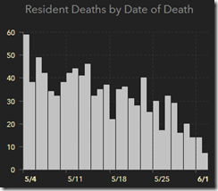
Wow, that’s impressive. Deaths are falling, and dramatically at that! This is all behind us, let’s go party!
But there is a small disclaimer below the chart, for those that care to read: "Death data often has significant delays in reporting…". That means that those low numbers in the near term are low because there’s no data yet. Those numbers will rise as time goes on, but that’s just fine, because there will be newer, lower numbers to report as time goes on as well.
Here’s a graph from TX’s dashboard.
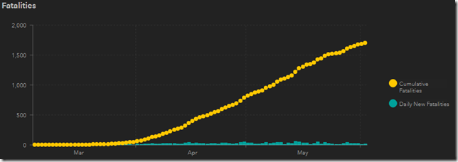
This is just dumb design: plotting two values, one that will constantly increase, and one that will remain relatively constant on the same scale. This will have two effects. First, the number of deaths per day (in blue) looks like a really small value. And comparing 20 to 1,698 does make 20 seem very small. But as the total number grows, and it will, every day, the scale is going to eventually have to be adjusted, and the daily value is going to be insignificant.
TX does the same charting with the number of cases, with the same effects.
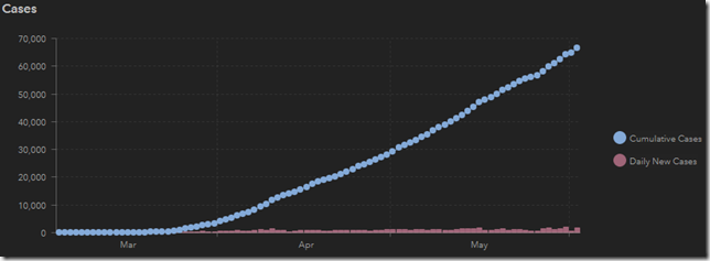
Maybe its incompetency that made these charts, but in the current political climate, and judging that these two states have pushed very hard to justify their reopening plans, it might not be a stretch to think this is just propaganda. The numbers don’t lie, they’re not telling you anything false. It’s just being presented in a way that looks most favorable.