Still watching the races, much to my dismay and angst. Last night I had a moment of disbelief. All those people insanely claiming, "this is all a hoax!" and "It’s all fake." For once, those people almost made sense. And the reason for that was the pure incredulous of the numbers I was seeing. I mean, look at this chart:

You see those tiny bars near the beginning around 6/1? That’s 1,000 new cases a day. Back then, that was an unbelievable number. It had me shaking my head at the stupidity of my fellow residents. These last few days, what can I say? Well, we went through multiple 1k days, then multiple 2k days, then 3k days, then 4k days. And then, things changed. There was one 5k day, but there wasn’t a 6k or 7k day. It went straight to 8k. Then 9k.
What are you supposed to think when something like that happens? If you follow the drama and opposing viewpoints, right around that time, it is claimed that the numbers are being inflated so that they can be reported lower later on. But that doesn’t make any sense to me because you still have the record of the shit days. You can say it’s better, but better relative to the worst? The worst still happened!
And it just seems like there’s some sort of disinformation campaign going on, just like everything has been in the last three years or so. But the data is still there and it’s just an argument over how to interpret that data.
While on that topic, in a previous post, I put up an image that I consider misleading. Let’s revisit that.
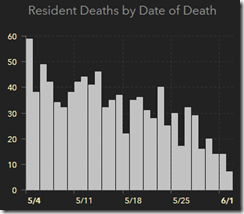
Now let’s compare that to how things are right now.

In that old post, I said the chart was misleading because there was a delay as to when deaths were reported, so the true numbers were at the beginning of the chart and because of the delay, it would always look like the numbers were falling. Well, look at the chart now. Looks pretty flat, except for the most recent days, where you can expect less reported deaths.
So what’s going to happen is, as the deaths are reported (later), it’s going to make the chart look like it’s climbing, but the chart only has 30 days to work with. As long as there is a 2-week delay in death reporting, that should keep the numbers pretty low. But even if not, it will still look better. It makes you wonder what a chart longer than 30 days would look like.
Comments are closed.